

Last week, you learned how to use Textual containers to arrange your widgets. This week, you will focus on using a grid, which works well for certain layouts that can be harder or more confusing to build by nesting containers.
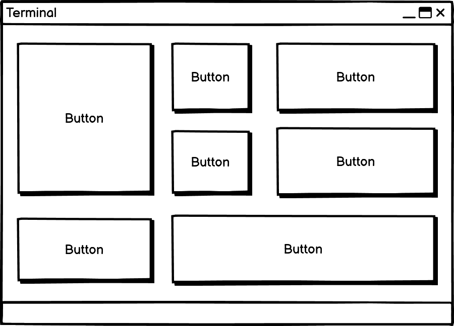
The grid layout doesn’t even use containers. You control the layout completely with CSS. To create complex layouts, individual widgets can span multiple rows, columns, or both.
Here is a drawing that demonstrates some of what you could do with a grid layout:
Textual grid layouts should NOT be confused with CSS Grids. Those are from the web development world and have little in common with what you will be doing with Textual.
When you want to grid layout in Textual, you will define the number of rows and columns that your grid needs to have using the grid-size CSS property. You will also need to set the layout: grid to apply the grid layout. At that point, widgets get added to the grid’s cells from left to right and then top to bottom.
You will start by creating a layout without CSS to demonstrate again what happens when you do not have a layout defined. Open up your Python editor and create a new file with the following code:
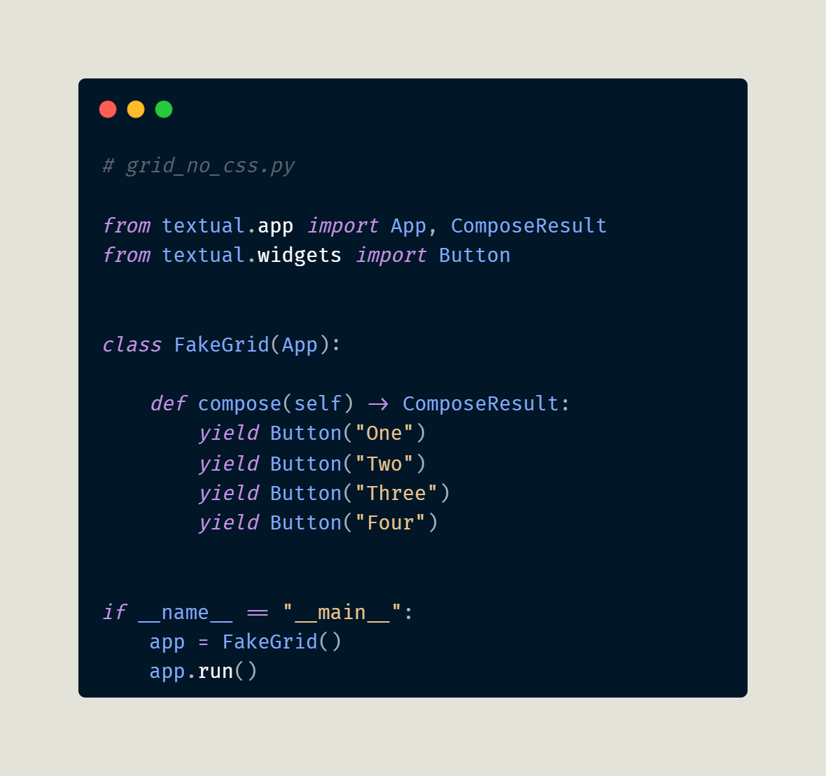
This code creates an application with four buttons, but they use Textual's default layout strategy. When you run this code, you will see this:
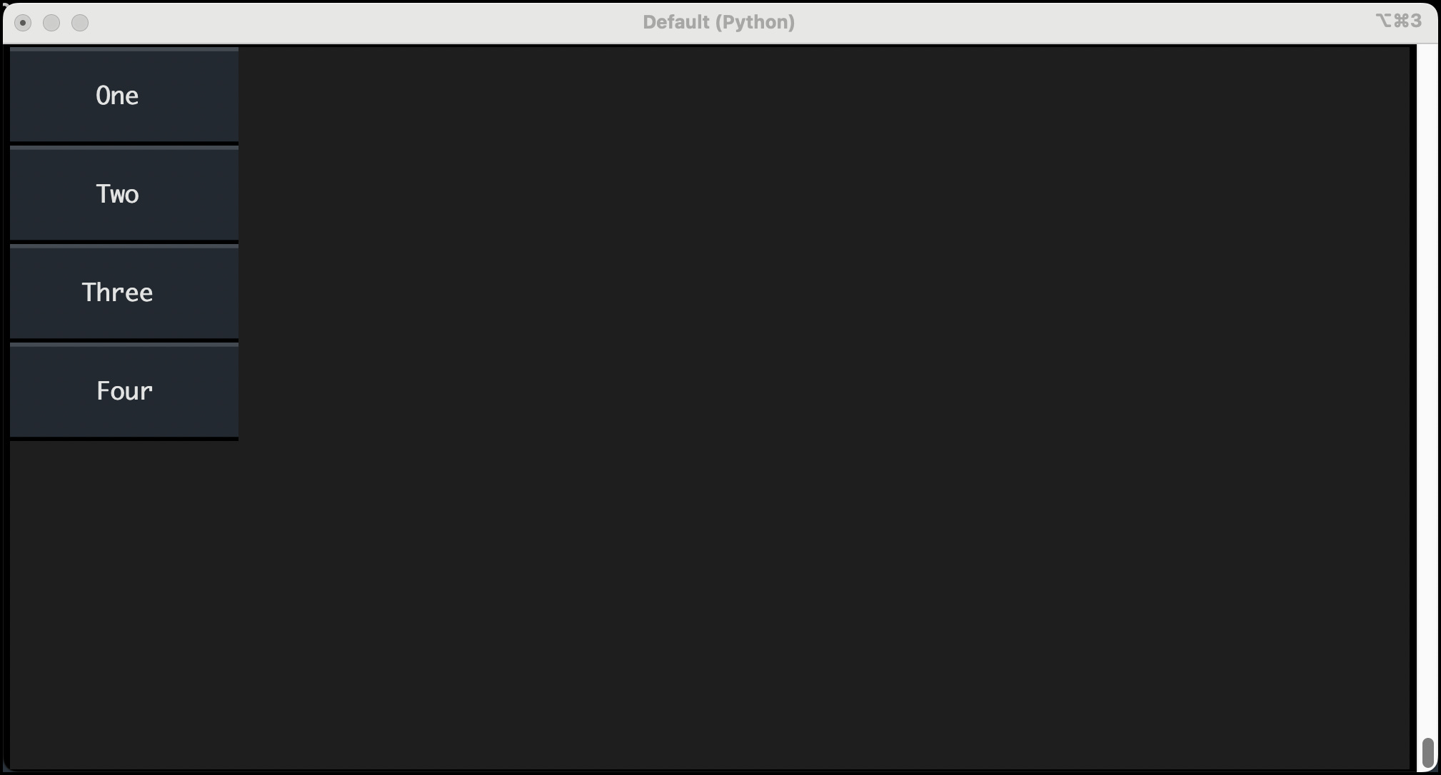
That’s obviously not a grid! You will need to rewrite the code to use a CSS grid layout instead.
First, create some CSS. Create a new file called grid.tcss and add the following:
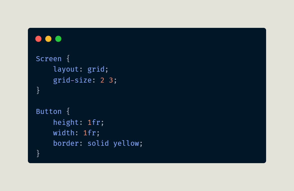
The CSS above will create a 2x3 grid with two columns and three rows. You will also set the height and width of the buttons so that they fill the “cells”.
Your grid has six cells, but you do not need to fill all of them. For this example, you will fill the first four cells. Open up your Python editor and create a grid.py file. Then enter the following code:
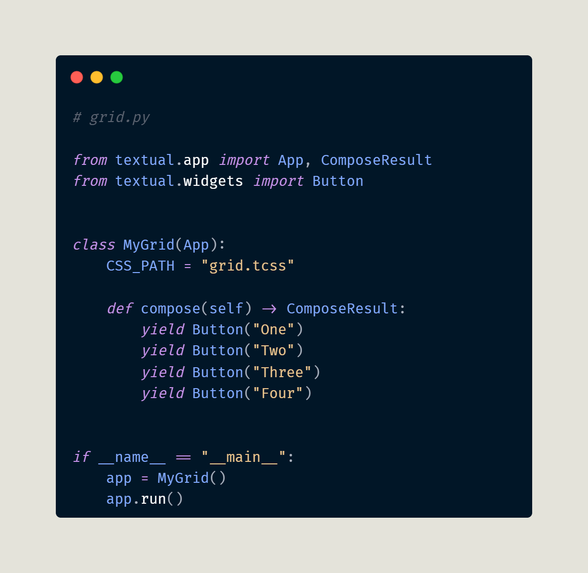
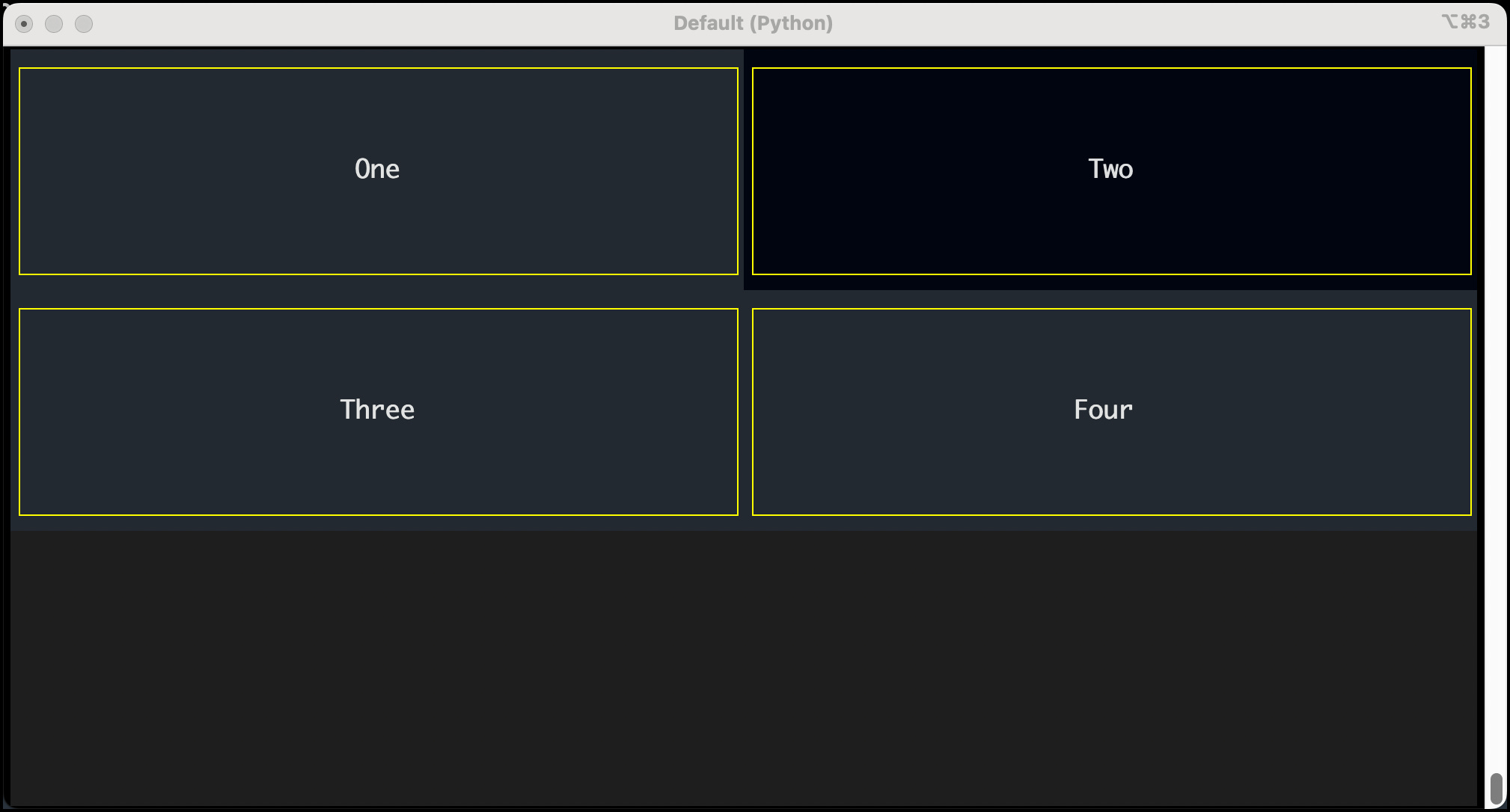
Your code will fill in the first four cells in your grid. The first two buttons go in the first row. Once that row is full, Textual will add the following widgets to the next row.
When you run this code, you will see something similar to this:
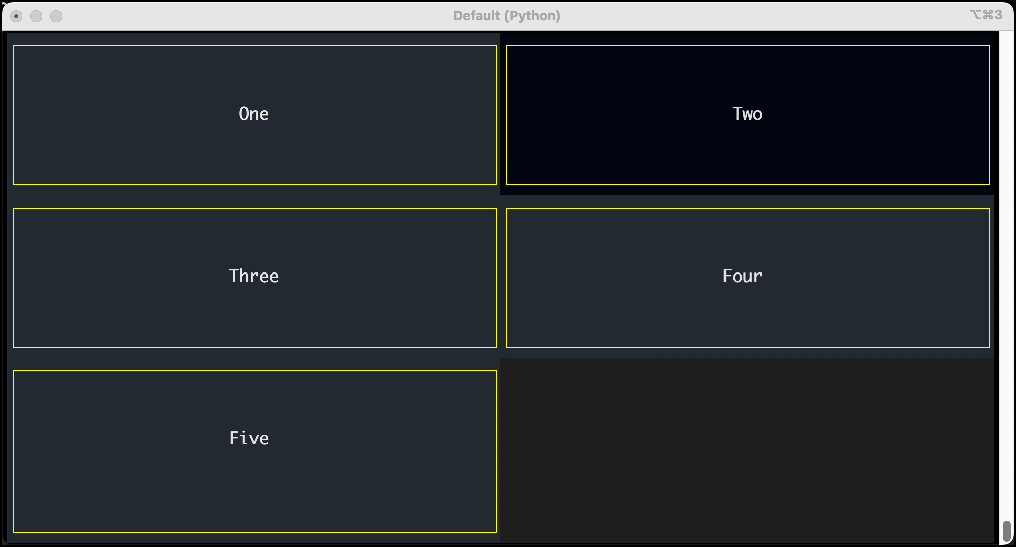
What will happen if you add a fifth button? Try it out and see! You should get something like this:
Now, you’re ready to learn how to adjust the sizes of your columns and rows!
Modifying Row and Column Sizes
You can make rows and columns have different relative widths or heights. This is a great way to make one row or column larger than another. Again, you do this in the CSS file.
You can adjust the rows and columns using the following parameters:
grid-columns
grid-rows
In your CSS file, you have a 2-column by 3-row grid. Create a new CSS file named row_adjust.css and add the following code to it:
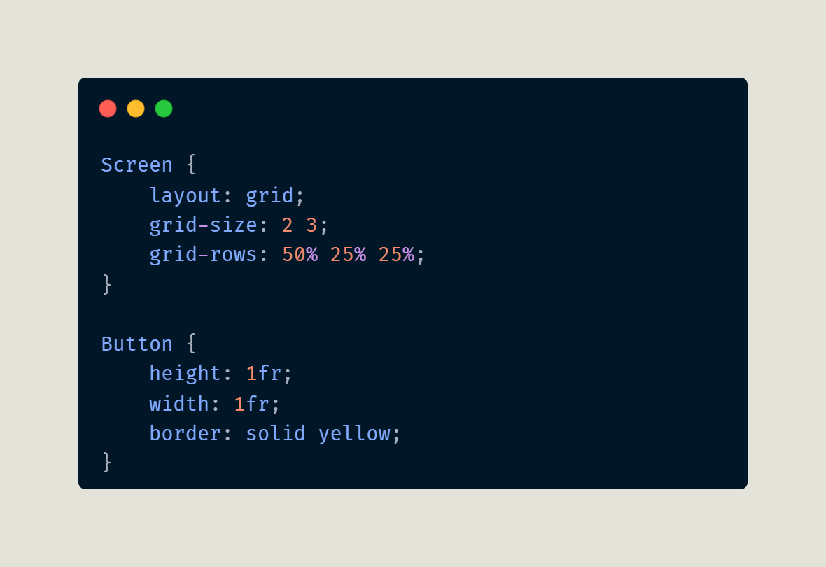
Everything here is the same except for the third parameter to Screen, which defines the grid-rows. Here, you set the first row to take up 50% of the space, and the other two rows to each take up 25%.
You must update your code to utilize your new CSS file. To keep things from getting confusing, create a new file named row_adjust.py and add this code to it:
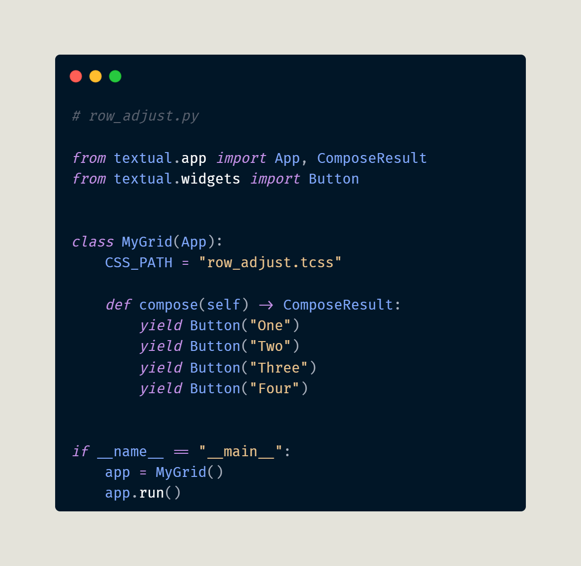
The only change here is to update the CSS_PATH to point to the new CSS file. When you run this code, you will see this:
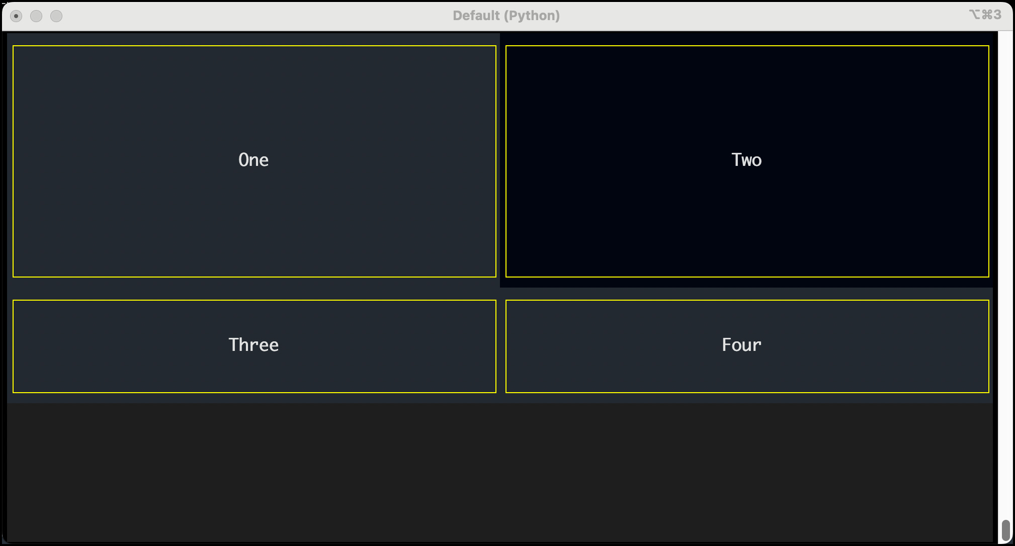
As expected, the first row in the grid is twice as high as the other two rows that follow it.
Note: If you do not specify enough values to match your rows or columns, then Textual will use the values you provided and repeat them. That means that if you have four columns in your grid but specify grid-columns: 3 2 then Textual will update it internally to be grid-columns: 3 2 3 2.
Automatic Row and Column Sizing
Textual also provides a way to set your column or row rules to resize based on the content in the widget automatically. You can use the string “auto” instead of specifying a unit or percentage size constraint. When you do that, Textual does the calculating for you.
Here’s an example in CSS where you set column one to be automatically sized:
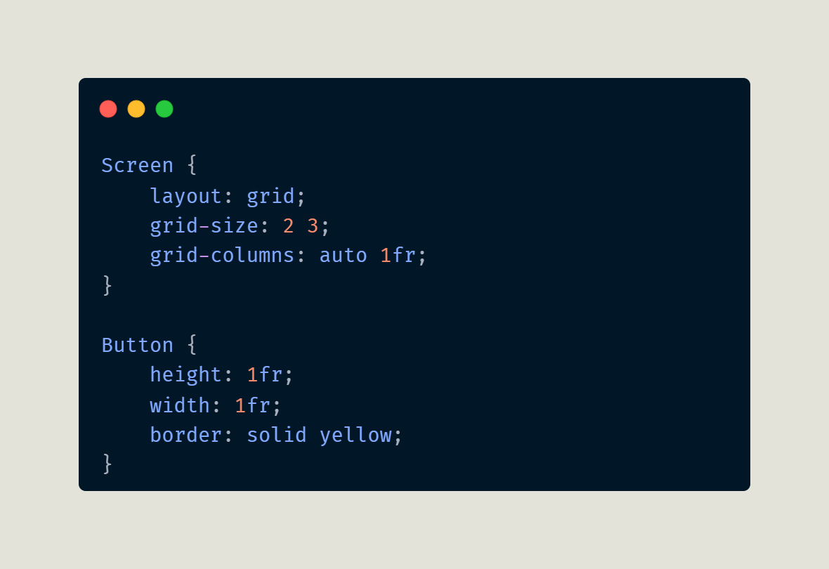
The second column in the CSS above is set to 1fr, so it fills the remaining space.
You need to create some Python code to see this CSS in action. Open up a new Python file and name it auto.py:
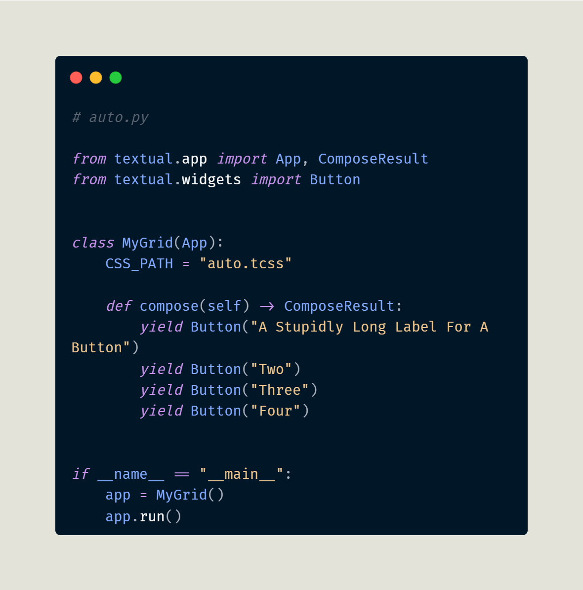
Here you create a set of four buttons as before. However, the first button in this code has an absurdly long label. When you run this code, the column resizes to fit that button's label within it:
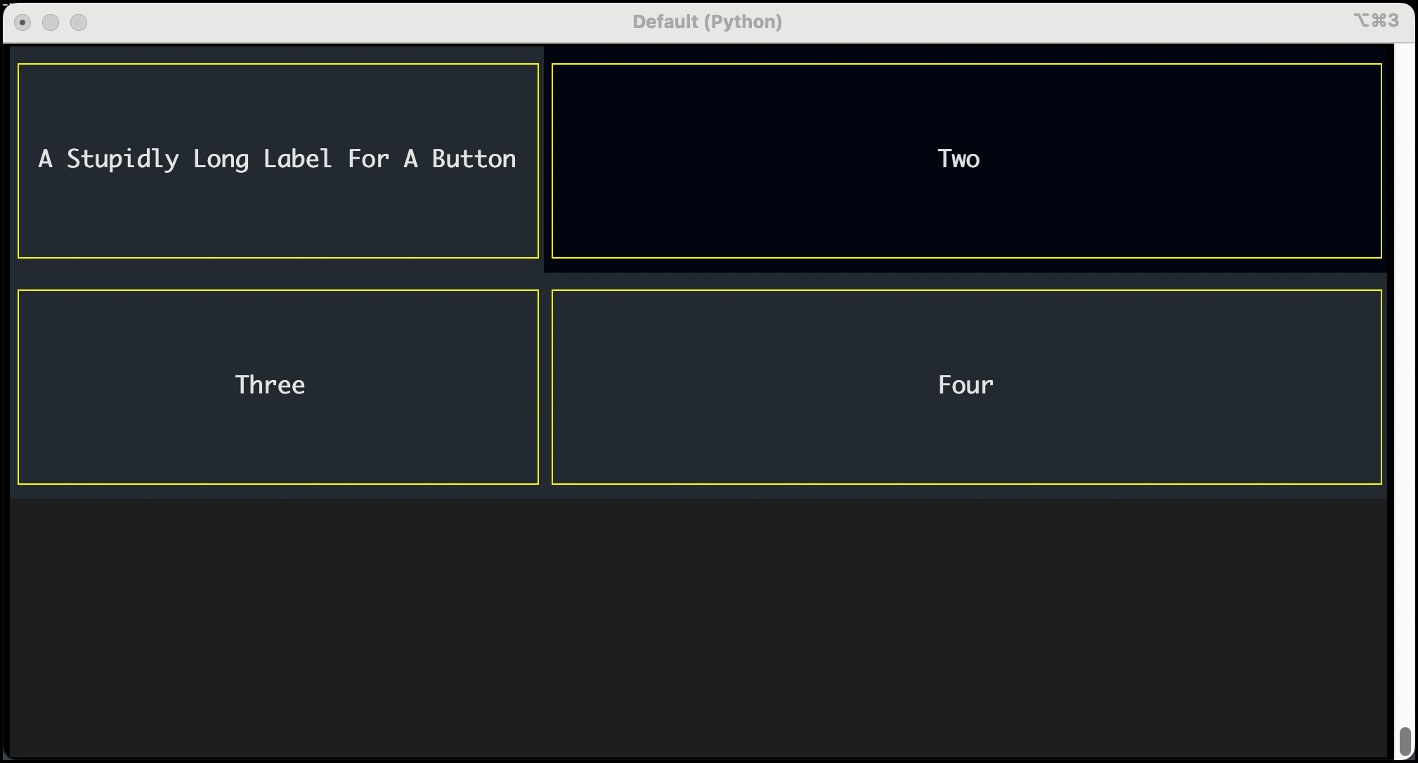
Try updating the label to something shorter or longer and re-run the code. It’s good practice, and you’ll learn more by modifying the code yourself.
Spanning Cells
The real power of grids comes into play when you learn how to make a widget span cells. You can stretch a widget across multiple columns, rows, or both! You can control cell spanning using the following directives:
column-span - followed by the number of columns to span across
row-span - followed by the number of rows to span across
To make a specific widget span across cells, you need a way to select that widget in CSS. The easiest way to select a widget is to give it a unique identifier or ID.
You will see how this works by writing some CSS code where you select a widget with the id of “one”. You may recall that the way you select an id is to use the octothorpe or hash-tag character followed by the id name. So, in the case of a tag called “one”, you would use #one.
Create a new CSS file in your text editor called col_span.tcss and enter the following code:
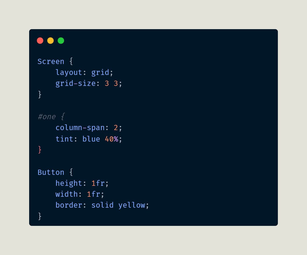
The CSS code will make the widget with the id of “one” span across two columns. Also set the widget’s tint to blue so it stands out more. You also set the grid to be 3x3 instead of 2x3, so keep that in mind. Now that you have the CSS code, it’s time to write some Python!
Open up your Python editor and create a new file called col_span.py, then enter this code into it:
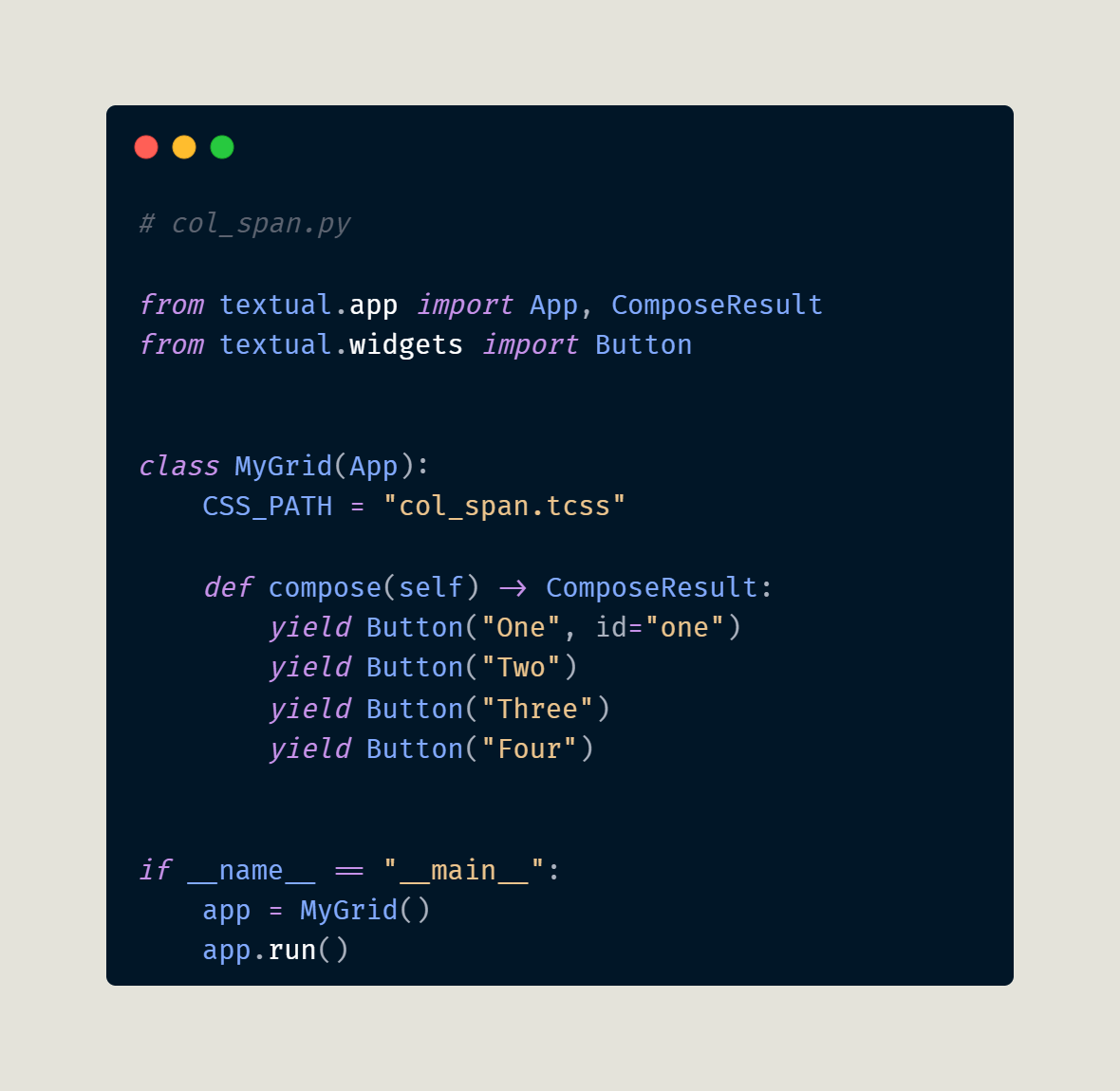
The first button widget is the one you gave the ID “one”. The CSS will select that widget and make it span two columns.
Here is the result you will see when you run the code:
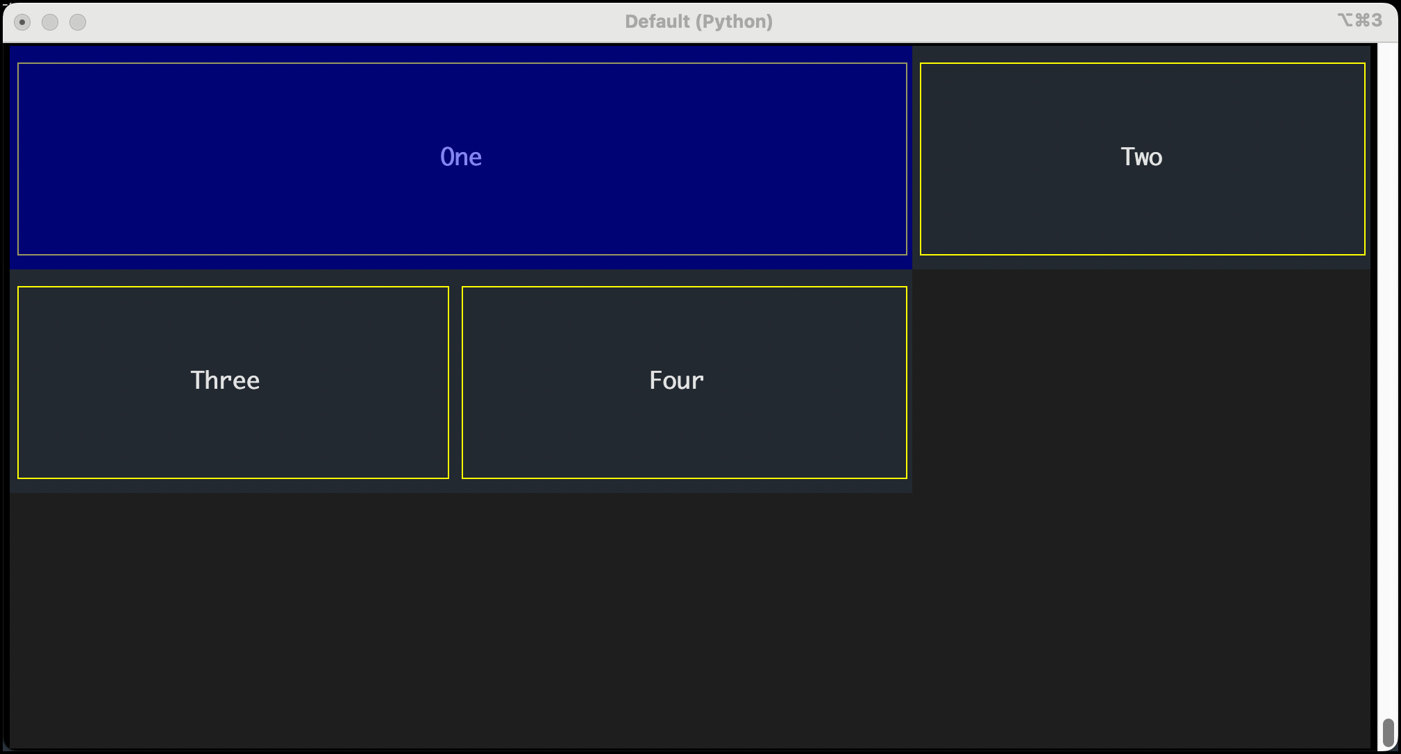
Try changing the number of columns spanned. You could also change the number of columns in the grid. Re-run the code after each change, or run it in developer mode so you can update the CSS in real time.
When you are done experimenting, go back to your text editor and create a new file called row_span.tcss. Yes, it’s time you learned how to use row-span too!
Here’s the code:
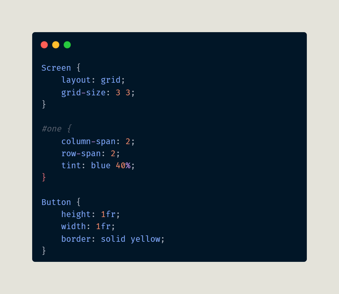
For this example, you will make the widget with the id of “one” span two columns AND two rows!
The Python code is the same as before except for the update to which CSS_PATH you are using:
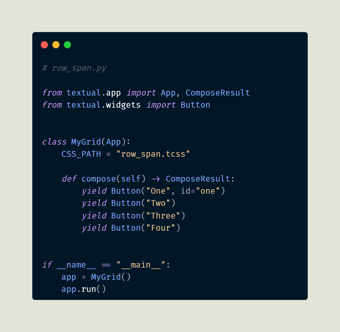
When you run this code, you will see this output:
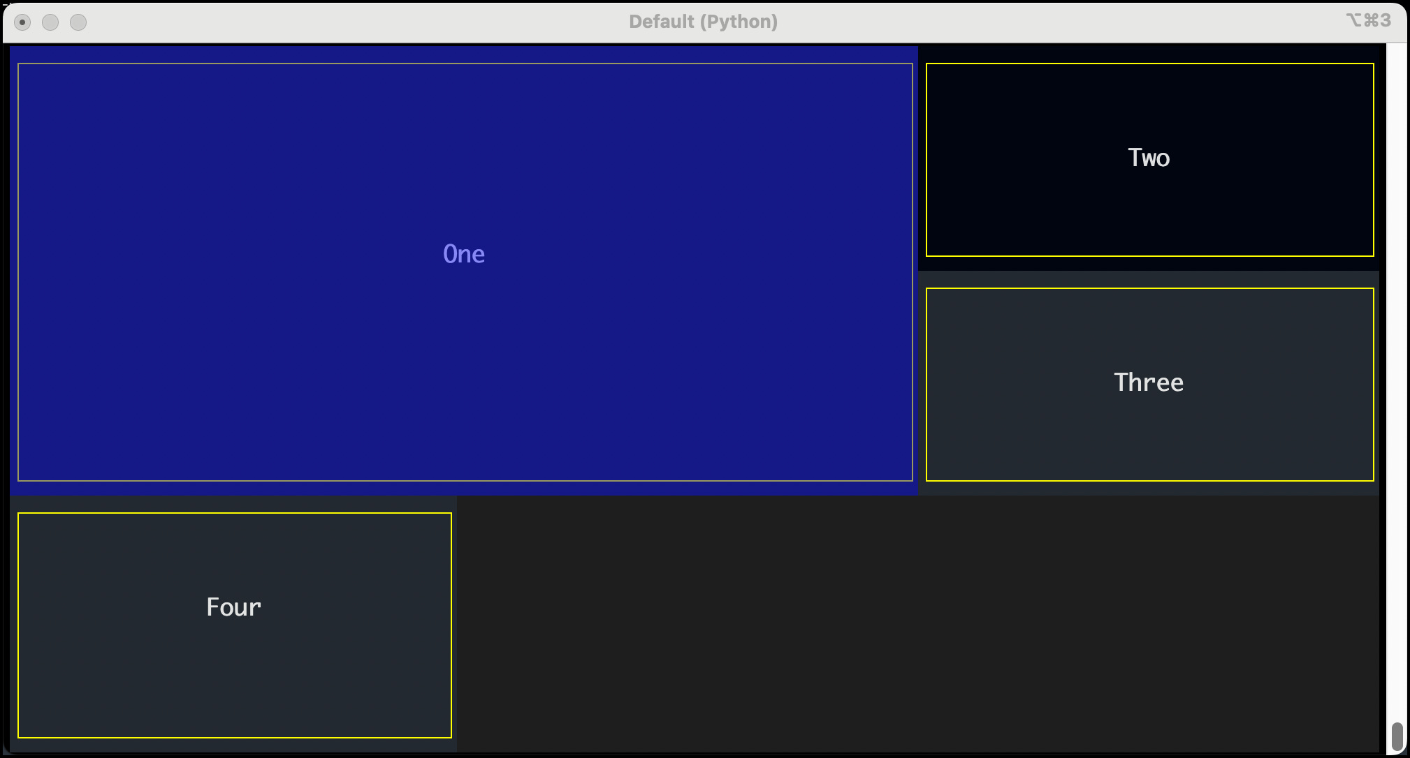
Good job! You now know how to make one or more widgets span columns or rows.
Adding a Gutter
Grids can also have gutters! The gutter is the space between the cells in a grid. You can change the gutter spacing using the grid-gutter CSS property. Cells have no gutter by default if you do not set a gutter property. That means that the cell’s edges touch each other. On the other hand, if you set a gutter value, it applies to ALL cells! You can only use grid-gutter on a widget with layout: grid applied to it.
You can see how this works by creating a new CSS file. For this example, you will set the Screen widget’s background color to something other than black. You can use any color you want, but for this example, use yellow. When you set the button, the cells will have spacing between them, revealing the background color of the Screen underneath your other widgets.
You will name this CSS file gutter.tcss and use the following code in it:
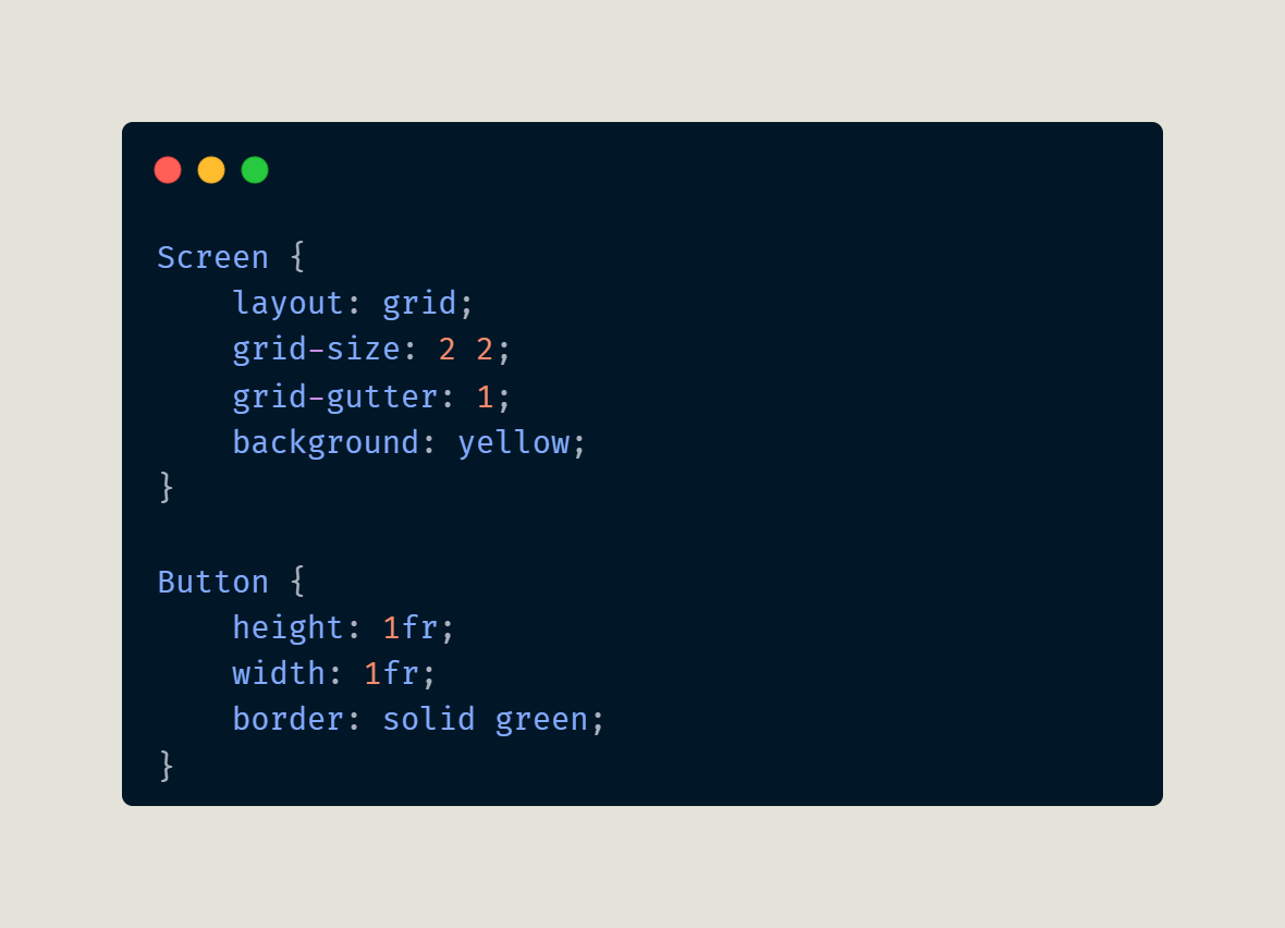
Your CSS sets the grid-size to a 2x2 grid. You create a grid-gutter of 1 (one). In general, terminal cells are twice as tall as they are wide, so the cell spacing will look a little uneven.
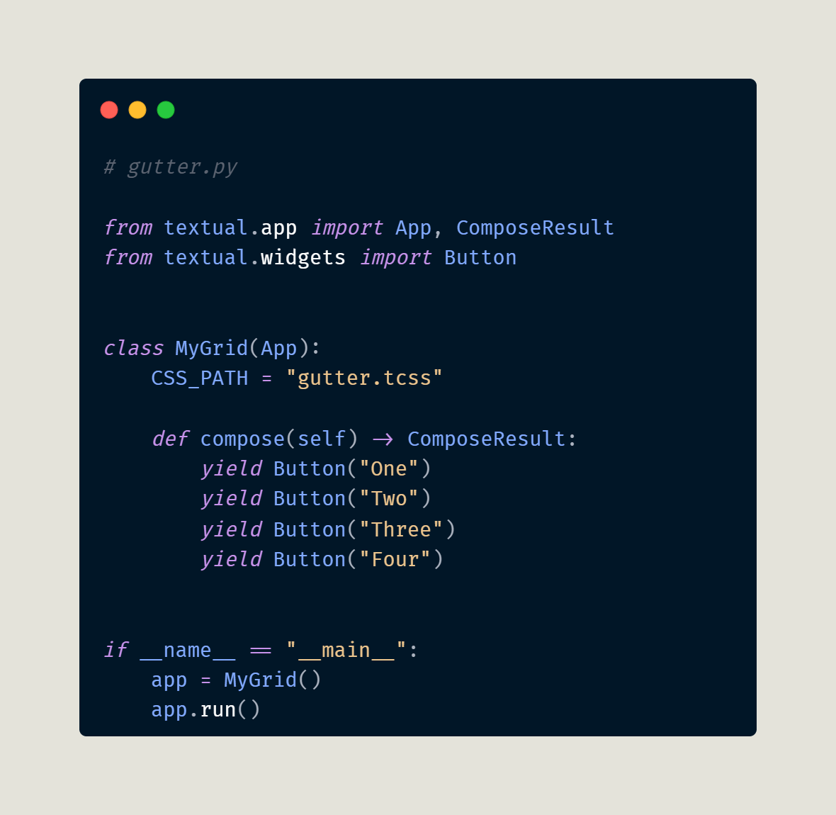
Open up your Python editor and create a new file called gutter.py. Add this code to it:
When you run your code, you will see something like this:
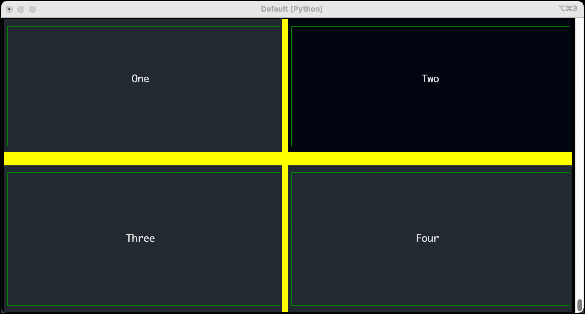
The grid-gutter can also accept two values, which allow you to set the vertical and horizontal gutters, respectively. Since the cells are taller than they are wide, you can use a grid-gutter: 1 2 setting to get consistent-looking spacing around your cells. Give it a try and see for yourself!
Wrapping Up
Now you know all you need to know to do grid layouts effectively in Textual. You can use this knowledge to create complex user interfaces for your applications. Alternatively, you can use nested containers (see the previous article) to do something similar.
As always, spend time practicing what you have learned, and experiment with different values to see how they change your application's appearance.